
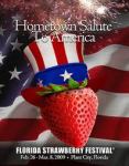
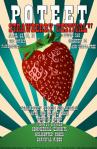
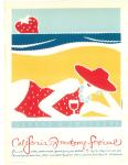


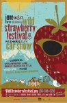
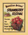
These are some Strawberry Festival posters I found. I like the ideas behind some of the posters, like a strawberry swimsuit or strawberry flowers. I like how a lot of them look painted as well.
Archive for the ‘Classwork’ Category
My favorite color is blue. I love blue because it is a very calming color to look at. Most shades of blue aren’t too bright or too dark to look at, and it seems like a nice pleasant color in between. 
Animate and Inanimate object: 
Logo: 
Portfolio Cover:  Back:
Back: 
CD Cover:  Back:
Back: 

 Sweet Charity
 Rainbow Trust Children’s Charity
 Variety the children’s charity
 International Charity for Ill Children
 Save the Children
 Coyotes Charities
 One Life
 A-Z Children’s Charity
 Fontaine Children’s Charity Foundation
 Barnardo’s
1. Do you have a facebook account? Yes
2. If you had to pay for it would you keep the account? No
3. Have you ever heard of frictionless sharing? Not until I read this article, and not really sure how I feel about it.
4. What do you think of the timeline addition to facebook? I don’t really mind the idea, but I can see why people disapprove.
5. Did you know what Spotify was before you read this article? No
http://www.cnn.com/2011/09/28/tech/social-media/facebook-rumors/index.html


I tried to pick a little bit of each for the company logos. There are some housing, health, and environment company logos on this post.
 Apple
Apple
 Blizzard Entertainment
 Facebook
 Google
 McDonalds
 Mtn Dew
 Reddit
 Taco Bell
 Yahoo
Yahoo
 Youtube
I picked these logos because they are some of my favorite websites, restaurants, and products.

Line: The linear marks made with a pen or brush or the edge created when two shapes meet.

Shape: A self contained defined area of geometric or organic form. A positive shape in a painting automatically creates a negative shape.

Direction: All lines have direction – Horizontal, vertical or oblique.

Size: Simply the relationship of the area occupied by one shape to that of another.

Texture: The surface quality of a shape – Rough, smooth, soft, hard, glossy etc. Texture can be physical or visual.

Color: Also called Hue.

Value: The lightness or darkness of a color. Value is also called tone.
Balance: Similar to balance in physics. A large shape close to the center can be balanced with a small shape close to the edge. A large light toned shape will be balanced by a small dark toned shape.

Gradation: Color from warm to cool and tone from dark to light produce aerial perspective.

Repetition: Repeating an image with some variation.

Contrast: The juxtaposition of opposing elements. Ex: red/blue, light/dark, and horizontal/vertical.

Harmony: Visually satisfying effect of combining similar, related elements.

Dominance: Gives a painting intrest, counteracting confusion and monotony.

Unity: Relating the design elements to the idea being expressed in a painting reinforces the principal of unity.
